


Dark Mode vs. Light Mode: Which One Should Your Website Use in 2026?
 Md Niaz Morshed
It is the most fiercely debated topic in modern web design: should your website embrace the sleek, modern aesthetic of Dark Mode, or stick to the crisp, trusted clarity of Light Mode? In 2026, this decision is no longer just about personal preference or looking "cool." It is a fundamental business choice that directly impacts readability, user retention, and conversion rates.
With nearly 82.7% of smartphone users now utilizing dark mode at a system level, forcing the wrong color palette on your audience can lead to massive bounce rates. At Shawonweb, we have analyzed the latest UX data to help you decide which mode is actually best for your specific industry, and how to implement it without destroying your user experience.
The Psychology and Data Behind Dark Mode
Dark mode has evolved from a developer-niche aesthetic into a global standard. When users browse in low-light environments, the dark theme reduces eye strain and extends battery life by up to 60% on modern OLED and AMOLED screens. Because dark backgrounds make bright colors pop, it naturally draws the user's eye to call-to-action (CTA) buttons and vivid imagery.
The Dark Mode Danger Zone
While popular, dark mode can be a conversion killer if poorly executed. A recent MIT usability study found that websites with improperly calibrated dark modes (e.g., pure #000000 backgrounds with stark white text) cause a 14% drop in reading comprehension due to an optical illusion called "halation," where text appears to blur and glow. Dark mode requires careful contrast balancing, usually utilizing deep grays rather than true black.
When to Use Dark Mode
1. SaaS Dashboards & Productivity Tools
If your users are staring at your application for 4+ hours a day (like coding environments, trading platforms, or analytics dashboards), dark mode is essential. It drastically reduces ocular fatigue, keeping users logged in longer. In 2026, a productivity app without a dark mode is immediately viewed as outdated.
2. Portfolios, Gaming & Entertainment
Dark backgrounds create a cinematic, immersive experience. If your website relies heavily on high-definition photography, video, or neon brand accents, dark mode acts as a theater in which your content is the star. It signals premium positioning, technical sophistication, and luxury.
The Undeniable Power of Light Mode
Despite the massive hype around dark mode, light mode remains the undisputed king of readability and trust. Human eyes evolved to see dark objects against light backgrounds (like ink on paper). For many industries, switching to a dark theme can actually harm the brand's perception and accessibility.
1. Blogs and Text-Heavy Content
If your website is primarily text-based (news sites, encyclopedias, or educational platforms), light mode is still the gold standard. High contrast between dark text and a white or off-white background maximizes reading speed and comprehension, particularly for older demographics or users with astigmatism.
2. E-Commerce, Medical, and Legal Sites
Light mode inherently communicates cleanliness, transparency, and tradition. Users perceive light-mode websites as more trustworthy in industries where authority and safety are paramount. A dark-themed banking site or medical clinic can subconsciously signal danger or mystery—emotions you explicitly want to avoid when asking for money or health data.
Head-to-Head Comparison: Dark vs. Light
| Factor | Dark Mode | Light Mode |
|---|---|---|
| Best Industries | Tech, Gaming, Crypto, Portfolios | E-Commerce, Legal, Medical, News |
| Emotional Vibe | Sleek, Premium, Mysterious, Modern | Clean, Trustworthy, Transparent, Classic |
| Readability | Lower for long paragraphs; requires high precision | Excellent for heavy text and quick scanning |
| Conversion Strength | High visual focus on neon/bright CTAs | Familiarity builds trust for traditional checkouts |
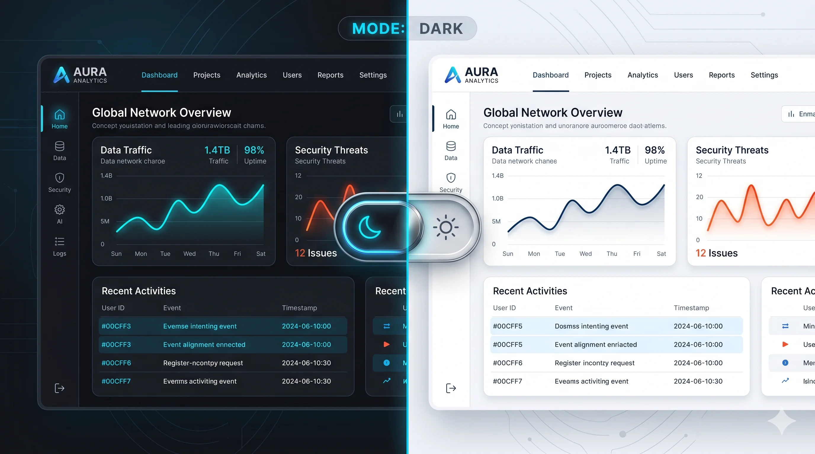
The 2026 Standard: The User-Controlled Toggle
The ultimate answer to the "Dark vs. Light" debate is simple: Don't force the choice. The industry standard in 2026 is implementing a seamless, OS-aware theme toggle. By using the CSS media query @media (prefers-color-scheme: dark), your website should automatically detect the user's system preferences the millisecond they land on your page, while providing a manual toggle button in the header for them to override it if desired.
Providing the choice ensures that you cater to the 80% of users browsing at midnight, as well as the office worker reading your blog under bright fluorescent lights at noon. You maximize engagement by giving power back to the user.
Comments
No comments yet. Be the first to share your thoughts!